
People read micro-details as signals of overall quality — even when they can’t articulate what exactly caught their attention.
Studies in environmental psychology consistently show that small design elements like fixtures, finishes, and interior signage shape how visitors judge an entire space within seconds.
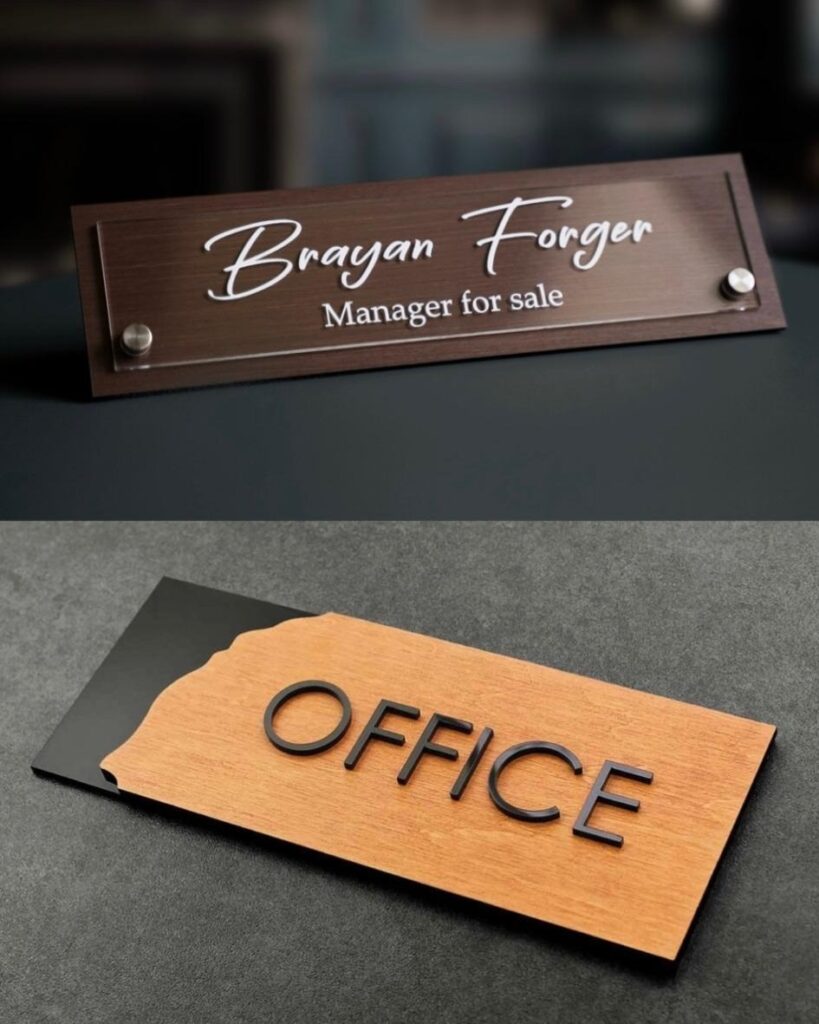
Door signs are one of those micro-details.
Most building owners treat them as a procurement checkbox — something ordered in bulk at the end of a fit-out. But research on spatial perception suggests they play a surprisingly active role in how visitors evaluate an environment, whether it’s a corporate lobby, a medical clinic, or a boutique hotel corridor.
The Psychology of First-Touch Elements
When someone approaches a door — whether it’s a hotel room, a doctor’s office, or a conference room — the sign is the first physical object they engage with at close range.
It’s the transition point between a shared corridor and a private space.
Research in environmental psychology calls these “threshold cues”, and they disproportionately influence expectations about what lies behind the door.
A flimsy plastic plate with a faded printout tells a story of neglect.
A thoughtfully chosen sign — one that matches the interior’s material language in texture, color, and typography — signals coherence and care. This isn’t about luxury.
A well-designed acrylic sign in a modern coworking space can be just as effective as a brass plate in a heritage building.
What matters is congruence between commercial door signs and the surrounding design intent.
Designers who take this seriously often source signs as part of their material specification, not as a facilities’ afterthought.
BSign Store specializes in personalized door signs for commercial and residential interiors — an example of the kind of manufacturer that allows architects to match signage precisely to their project’s visual identity, from material finish to mounting detail.
Practical Considerations That Are Easy to Overlook
Beyond aesthetics, several functional factors determine whether office door signs and room identifiers actually perform well over time.
Mounting height is one — ADA compliant signs require centers at 60 inches on the latch side of the door, yet many installations ignore this, creating accessibility issues and inconsistent sightlines down a corridor.
Contrast ratio matters just as much: a sign that looks elegant in a showroom may become nearly invisible against a similarly toned wall under actual corridor lighting.
Material choice has long-term implications too. In healthcare and food service environments, signs need to withstand regular cleaning with chemical agents.
In residential buildings with direct sunlight exposure, UV-resistant materials prevent yellowing and fading within the first year.
These aren’t glamorous considerations, but they’re the difference between interior signage that ages gracefully and signage that quietly degrades the space.
Key Factors That Shape Perception Through Door Signage
When specifying door signs for any commercial or residential project, these are the core factors that determine both immediate impact and long-term performance:
- material consistency — signs should belong to the same material family as the surrounding interior finishes, reinforcing visual coherence across the space
- mounting precision — uniform height, alignment, and spacing create a professional rhythm along corridors that visitors register subconsciously
- accessibility compliance — tactile lettering, Grade 2 Braille, and correct placement per ADA standards ensure the space works for everyone
- contrast and readability — sufficient color contrast between text and background under real lighting conditions, not just in catalog photos
- environmental durability — resistance to UV exposure, chemical cleaning agents, and physical wear appropriate to the specific environment
Conclusion
Door signs sit at the intersection of branding, accessibility, and interior design — yet they remain one of the most underspecified elements in commercial and residential projects.
The spaces that feel most polished and welcoming are almost always the ones where signage was planned from the schematic phase: materials chosen to complement the interior palette, placement verified against accessibility standards, and durability matched to the environment.
It’s a small line item in the overall fit-out budget, but its influence on how visitors perceive and navigate a space is disproportionately large.
Getting door signage right is one of the simplest ways to elevate the entire experience of a building.