
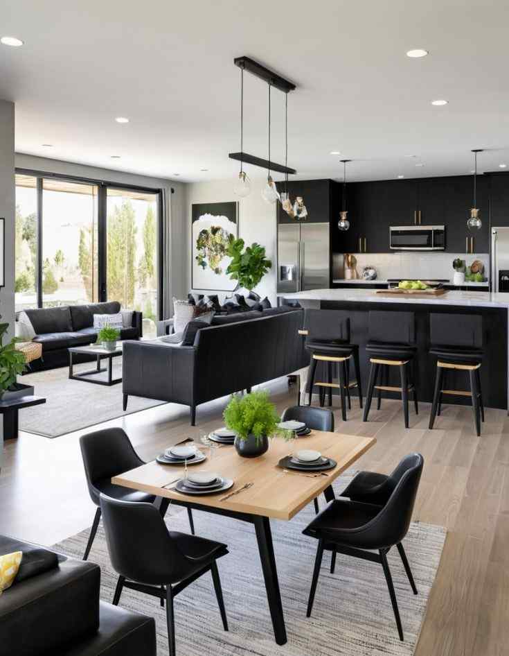
For the longest time, my open living room and kitchen were making me bored with them. So I thought of creating the color schemes paint ideas for the open living room and kitchen for you.
The paint colors clashed like my kids’ socks on laundry day.
I finally took the plunge and researched color schemes paint ideas for open living room and kitchen that would make both spaces flow together beautifully.
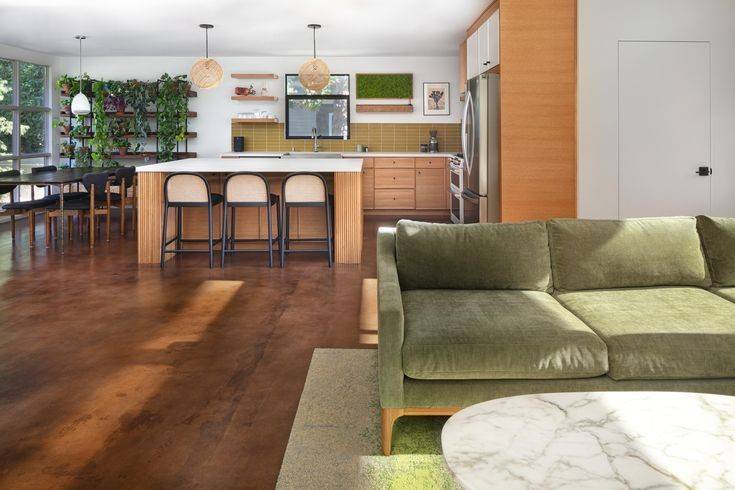
Open concept living isn’t just a trend anymore, it’s practically standard in most newer homes.
According to a recent housing survey, about 70% of new builds feature some form of open concept between kitchen and living areas.
The challenge? Making these connected spaces feel cohesive without turning your home into one giant blob of beige. Trust me, I’ve been there!
I’ve put together 14 color combinations that actually work in real homes with real families.
Let’s dive into some fantastic paint ideas that’ll transform your space from disconnected to drop-dead gorgeous!
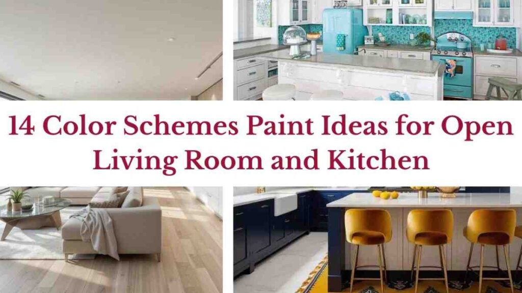
14 Color Schemes Paint Ideas for Open Living Room and Kitchen
Picking color schemes paint ideas for open living room and kitchen for an open concept space isn’t like choosing for separate rooms.
You need shades that play nicely together while still giving each area its own personality.
Think of it like dressing siblings for a family photo—coordinated but not identical twins.
The key is strategic placement—using your accent colors thoughtfully on specific walls, islands, or architectural features.
Ready to see some combos that really sing? Here are my absolute favorites that I’ve used for clients and even in my own home!
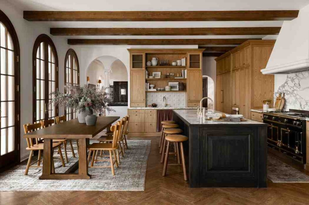
The Timeless Greige and White Oak
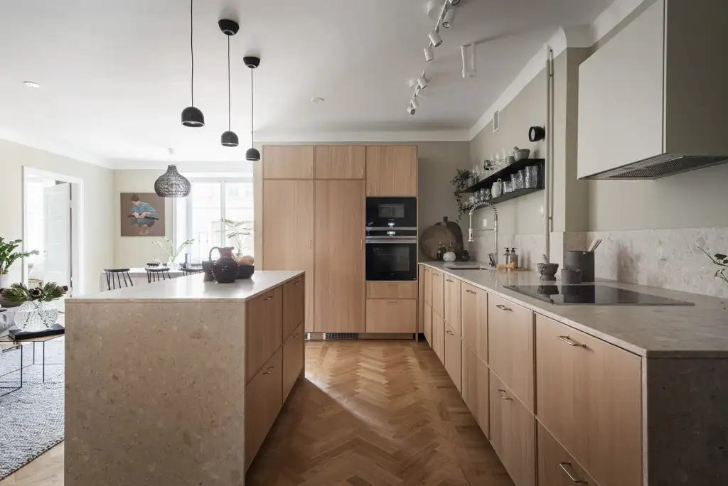
This might be my all-time favourite combo for open spaces.
Greige (that perfect gray-beige hybrid) on the walls paired with white oak cabinets or flooring creates this incredible warmth without feeling stuffy.
I used this in my own home three years ago and still love it every single day.
The greige walls (I used Sherwin-Williams Agreeable Gray) create this gorgeous neutral backdrop that changes throughout the day as the light shifts.
What makes this combo so great is how it lets your furniture and decor shine. My red sofa pops against these neutral walls in a way it never did with our old paint color.
Burnt Orange and Muted Beige to add Depth
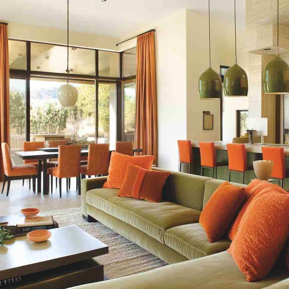
Talk about a combination that makes your space feel instantly cozy.
I used this palette in a client’s mountain-view home last fall, and wow, the transformation was incredible.
The burnt orange accent wall behind her kitchen cabinets created this amazing focal point that pulled your eye through the space.
We balanced it with soft muted beige (Benjamin Moore’s Manchester Tan) on the living room walls.
My client added copper accessories throughout both spaces which tied everything together so beautifully.
Honey Mustard and Soft White For Vibrant Feel
This combo is for those who want a bit more personality without going completely wild.
Honey mustard might sound like a sandwich condiment, but as a wall color? Absolute magic.
I painted my sister’s open kitchen this gorgeous honey mustard shade (Behr’s Charismatic) and paired it with soft white (Benjamin Moore Simply White) in the living area.
The contrast is stunning, but still feels connected.
Her kitchen feels warm and inviting, while the living space feels bright and airy.
The colors work together because they share the same warm undertones.
The Classic Warm White and Mocha
Sometimes, simple really is best.
A warm white paired with rich mocha accents in the open living room and kitchen creates this timeless look that never feels trendy or dated.
I recently finished a project using Benjamin Moore’s White Dove throughout most of an open concept main floor.
Then we added this gorgeous mocha color (Sherwin-Williams Turkish Coffee) on the kitchen island and a couple of living room built-ins.
The homeowners were worried it would feel too plain, but once we added wood tones and textured fabrics, the space came alive.
Go Bold with Navy Blue and Mustard Yellow
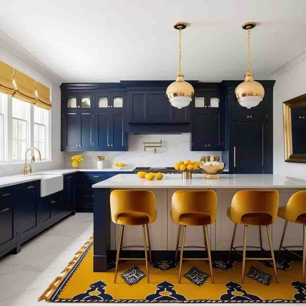
For the brave souls out there! This combo packs a punch, but man, when it’s done right, nothing creates more impact.
My most memorable project using these colors was for a young couple who wanted something different from the all-white everything trend.
We used navy blue (Benjamin Moore Hale Navy) on the kitchen cabinets and a gorgeous mustard yellow accent wall in the living room.
The rest of the walls were a soft warm gray to give your eye somewhere to rest. The result was this incredibly vibrant space that still felt sophisticated.
The Edgy Graphite and Muted Olive
This combination feels so current but also completely timeless.
I used graphite (Sherwin Williams Peppercorn) and muted olive (Benjamin Moore October Mist) in a bachelor’s loft last year.
The graphite color on the kitchen cabinets looked super sleek against his concrete floors.
Then we painted an olive accent wall in the living area which softened the industrial vibe just enough.
What surprised me most was how versatile this color combo turned out to be.
He’s changed his furniture twice since the paint job and both times the colors worked perfectly with his new pieces.
Sometimes the most unexpected combinations end up being the most flexible!
Ivory and Muted Terracotta for Boho feel
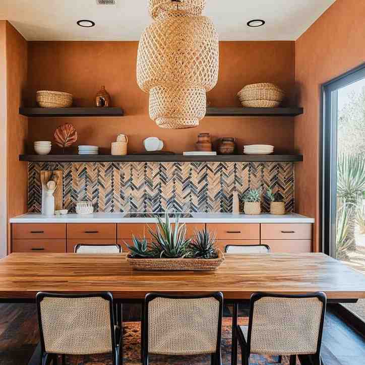
For anyone wanting that laid-back, collected-over-time boho vibe, this color combo is your best friend.
Ivory walls create the perfect backdrop for all those textured accessories that make boho style so appealing.
I used Benjamin Moore’s White Sand throughout a client’s open concept first floor, then added a muted terracotta (Behr’s Tandoori) on the kitchen island and a living room reading nook.
The colors are subtle enough to let all her amazing textiles and plants take center stage, but interesting enough that the space doesn’t feel boring.
Mint Green and Soft Pink for Vintage vibes
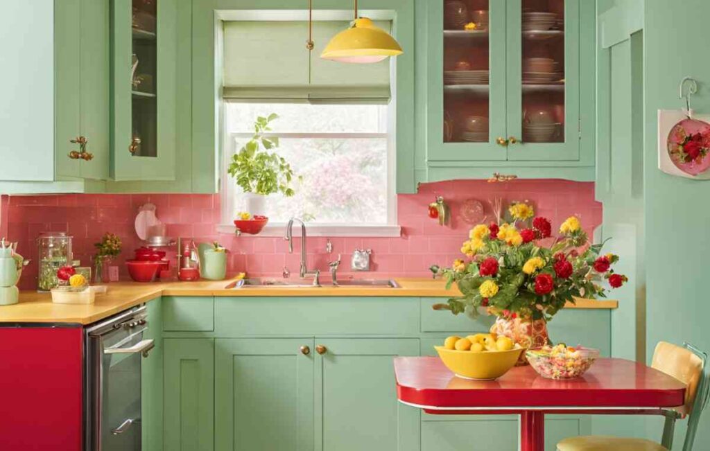
Don’t run away yet! When done right, this combo feels fresh and vintage-inspired without looking like an ice cream parlor.
I used the palest mint green (Benjamin Moore Hollingsworth Green) in a client’s kitchen with white cabinets.
Then we added the softest blush pink (Sherwin Williams Romance) to the living room walls.
Both colors are so muted they almost read as neutrals, but they have just enough color to feel intentional and unique.
What really made this combo work was adding black accents throughout both spaces.
Matte black hardware in the kitchen and black picture frames in the living room gave the pastels some edge.
Go for the Monochrome theme
Monochrome doesn’t mean boring! Using different shades of the same color creates this amazing sense of depth while still feeling completely cohesive.
Last spring, I helped a friend transform her open concept space using varying shades of blue-gray.
The kitchen cabinets went darkest (Benjamin Moore Normandy), the walls a medium tone (Benjamin Moore Cloudy Sky), and trim in the lightest shade (Benjamin Moore Horizon).
The result was this incredibly calming space that flowed perfectly from area to area.
Plus, the monochrome backdrop made her colorful art collection absolutely shine.
Earthy Tones for Mid-Century Modern
This combo works so well with mid-century furniture, it’s almost unfair.
Warm earthy tones like terracotta, olive green, and mustard yellow create the perfect backdrop for those clean mid-century lines.
I helped a couple refresh their 1960s home using Benjamin Moore’s Alexandria Beige throughout with Strategic accent walls in Cavern Clay and Rookwood Sap Green.
Their walnut furniture absolutely popped against these colors! The space felt intentionally retro without looking like a time capsule.
What I love most about this palette is how it brings the outdoors in.
Their large windows overlooking a wooded yard seemed to extend right into the room thanks to the earthy colors.
Teal and Turquoise for the Coastal theme
Nothing says “coastal” quite like varying shades of blue-green.
This combo works year-round, not just summer.
I used Benjamin Moore’s Aegean teal turquoise on kitchen cabinets and Sherwin-Williams Ebbtide in the living space for a family who missed their beach vacations during the pandemic.
We kept everything else light and natural with lots of woven textures and light wood tones.
The result was this gorgeous coastal-inspired space that never felt themed or kitschy.
My favorite part was watching their kids’ reactions when they saw the finished space.
Their 8-year-old said it felt like “living inside the ocean but not getting wet!” Kids always give the most honest reviews.
Black and Pink for a Bold Look
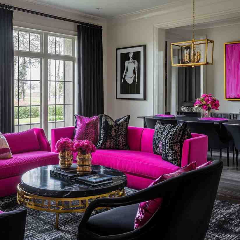
This might sound extreme, but stick with me! When done right, black and pink create this incredibly chic, fashion-forward space.
The trick is using black strategically and choosing the right pink.
I used Sherwin-Williams Tricorn Black on kitchen lower cabinets with white uppers, then the most gorgeous dusty pink (Benjamin Moore First Light) in the living area.
We added gold accents throughout both spaces, which warmed everything up beautifully.
The homeowner described it as “Parisian apartment meets New York loft”, and I couldn’t agree more!
She now says getting ready for work is more fun because starting her day in a beautiful space puts her in a great mood.
That’s exactly why color matters so much!
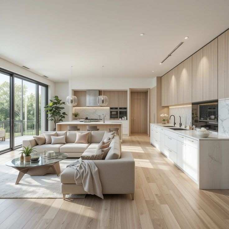
Brown and cream for the Airy feel
Hear me out—brown and cream can actually feel light and airy when paired with the right cream.
This combination creates warmth without heaviness.
I used this palette in a north-facing open concept space that always felt cold and unwelcoming.
The warm brown (Benjamin Moore Weimaraner) on the kitchen island and one living room wall brought much-needed warmth.
Creamy walls (Sherwin-Williams Alabaster) throughout the rest of the space kept things feeling open and bright. The transformation was amazing!
Six months later, the homeowners say they spend way more time in these spaces than they used to.
They didn’t realize how much the previous cool-toned paint was affecting their comfort level.
White and Muted Blush for Scandinavian Vibe
This combination feels so fresh and clean while still having personality! Perfect for anyone who loves that minimalist Scandinavian aesthetic.
I used Benjamin Moore Chantilly Lace throughout most of a client’s open concept main floor, then added the prettiest muted blush (Sherwin Williams Intimate White) on the kitchen island and built-in bookshelves.
We kept everything else natural and textural—lots of light wood, woven pieces, and plants. The result was this amazingly peaceful space that still had character.
My client works from home and says the calm palette has actually improved her productivity. Never underestimate how much your environment affects your mood and energy!
Conclusion
Choosing colors for open concept spaces doesn’t have to give you a headache! The key is thinking about how the colors will flow together and considering the overall feeling you want to create in your home.
Remember that paint is one of the most affordable ways to completely transform a space. If you try a color combo and it’s not quite right, you can always paint again! I once painted my own kitchen three times in a month before finding the perfect shade. My husband thought I’d lost my mind, but the end result was worth every minute of work.
Start by testing large swatches on different walls and observe them throughout the day as the light changes. What looks perfect at 9am might feel completely different by dinner time.
And don’t forget that your home should reflect YOU. While all these combinations work beautifully, the absolute best color scheme is one that makes you happy every time you walk through the door.
So grab those paint samples and get started! Your perfect open concept color scheme is just a weekend project away. And when you’re done, I’d love to hear which combination you chose!